Tutorial
Cohort analysis, from zero to confident
This guide teaches cohort analysis itself, then every setting of the Cohort Matrix visual — with a small sample dataset you can download and follow along with.
1. What a cohort matrix tells you
A cohort is a group of entities that started in the same period — customers whose first purchase was in January, users who signed up in week 12, SKUs launched in Q2. The matrix puts one cohort per row and asks the same question across each column: how many of them were still active 1, 2, 3… periods after they started?
Three reading directions, three insights:
- ●Across a row — the survival curve of one generation: how fast does a January customer fade?
- ●Down a column — quality over time: are newer cohorts stickier at month 3 than older ones? This is where product and marketing changes show up.
- ●The diagonal — calendar effects: a bad month (outage, price change) cuts diagonally through all cohorts at once.
2. Quick start
- Add the visual to a report page.
Once it is on AppSource: Get more visuals → search “Cohort Matrix”.
- Drop your entity (Customer, User ID, SKU…) into Entity.
- Drop the activity date into Event date.
A date column, or a text key like
2024-09. Don’t use a date hierarchy — the visual will detect it and tell you to use the plain column. - Optionally drop a value (Sales, Quantity) into Value.
Even if you only analyze counts, adding a measure keeps Power BI from cross-joining dimension tables and hitting row limits.
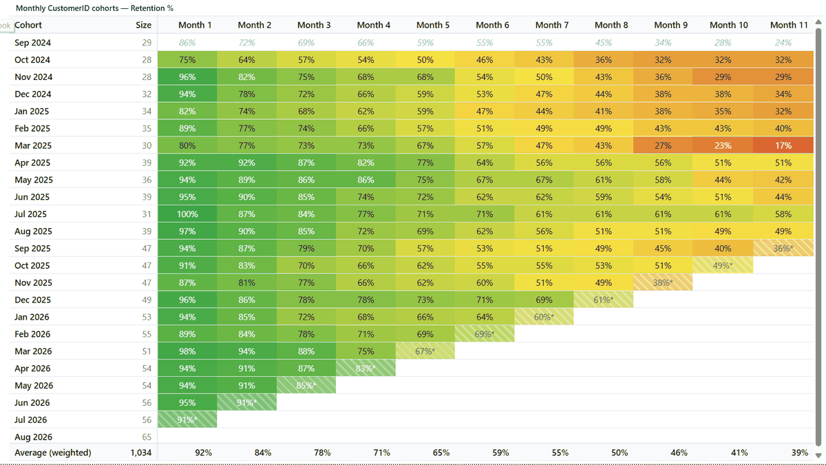
- Read the matrix. Rows are cohorts by first activity; the Size column counts new entities per cohort; each cell shows retention for that period offset.
3. The concepts that make or break the analysis
Classic vs unbounded retention
Classic counts an entity in month 3 only if it was active in exactly month 3. Unbounded ("in or after") counts it if it was active in month 3 or any later month — so a customer who skips a month but comes back still counts as retained. Classic shows activity rhythm; unbounded shows true survival. Unbounded is always ≥ classic, and it can never rise as you move right.
Incomplete periods
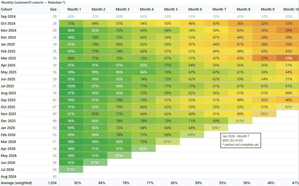
The bottom-right of every cohort matrix is a staircase of cells that haven’t happened yet — and one diagonal of cells that are in progress. Cohort Matrix leaves future cells blank (never a fake 0%) and hatches the in-progress diagonal with an asterisk. The averages row ignores both. If partial data bothers your audience, switch on Complete periods only.
Why the first cohort lies
Filter a report to “last 24 months” and the first month’s cohort inflates: everyone active that month looks “new” because their earlier history is filtered away. Cohort Matrix keeps the row but excludes it from color scaling by default (gray, italic, with an explaining tooltip) so it can’t distort the heatmap. Toggle: Exclude first cohort.
4. Settings reference
Setup
| Setting | What it does | When to change it |
|---|---|---|
| Cohort grain | Day / Week / Month / Quarter / Year buckets for cohorts and periods. | Match how your business thinks: subscriptions → month, retail → week, B2B contracts → quarter or year. |
| Retention definition | Classic (“in that period”) vs unbounded (“in or after”). | Unbounded for survival questions; classic for engagement rhythm. |
| Metric | Entity count / retention %, Value sum, or Value per cohort entity. | Value per entity is the fair way to compare money across different-sized cohorts. |
| Max periods | Caps how many offset columns are shown. | Keep 12–24 for readability on wide date ranges. |
| Min cohort size | Hides cohorts smaller than N. | Small cohorts produce wild percentages; 5–10 is a sane floor. |
| Complete periods only | Blanks in-progress (hatched) cells. | Board decks and exports where asterisks need explaining. |
| Churn view | Shows 100% − retention; colors auto-invert. | When the audience thinks in churn. Semantics and colors flip together. |
| Newest first | Sorts cohort rows descending. | Ongoing monitoring, where the latest cohorts matter most. |
| Fiscal year starts | Shifts quarter/year bucket boundaries. | Any company whose FY isn’t January. |
Display
| Setting | What it does |
|---|---|
| Show header / Header text | The smart caption writes itself from your fields and settings; override it with your own text if you prefer. |
| Hide period 0 | On by default for retention % — month 0 is 100% by definition and wastes a column. Toggle off to show it. |
| Averages row | Adds a per-column average. Weighted weights by cohort size and uses complete cells only. |
| Cohort size column | Shows how many entities each cohort started with. |
| Absolute numbers | Counts instead of percentages in the cells. |
| Decimals / Font size / Dark mode | Presentation controls. |
Heatmap
| Setting | What it does |
|---|---|
| Palette | Curated presets (teal, ocean, forest, purple, heat, grayscale) or Custom. Preset swatches are shown read-only; pickers appear only under Custom — what you see is what rules. |
| Custom colors | Low / middle / high gradient stops. Default is a diverging red-yellow-green. |
| Use middle color | 3-stop diverging vs 2-stop linear ramp. |
| Reverse colors | Manual flip; combines correctly with churn view’s auto-invert. |
| Scale scope | Across matrix (one scale for all cells, Amplitude-style) or Within each row (each cohort scaled to its own maximum, Mixpanel-style — compares the shape of survival curves). |
| Scale max | Fixes the top of the scale (e.g. 50%) so month-1 values don’t compress the rest. Hidden in row mode. |
| Exclude first cohort | Keeps the window-edge cohort out of the color scale (default on). |
5. Advanced: relaunch cohorts (cohort date override)
Normally the cohort is the entity’s first event. Sometimes you want a different anchor: retention of SKUs since their relaunch, customers since a re-onboarding, users since a campaign. Drop that anchor date into the Cohort date well:
- ●Cohorts group by the override date, not first activity.
- ●Events before the anchor are excluded — pre-relaunch sales don’t pollute the analysis.
- ●If an entity has several anchor dates, the latest wins.
- ●The caption appends “(cohort = your field)” so nobody misreads the chart.
Try it with the relaunch sample: three SKUs with launch dates; S1 relaunched in March 2026 shows offsets 0, 1 and 3 — and its pre-launch billing is correctly dropped.
6. Performance checklist
- Use month-grain date keys (a Year-Month column) instead of full timestamps when analyzing monthly cohorts — far fewer distinct rows.
- Always include a measure in Value, even for count analysis — it prevents Power BI from cross-joining dimensions into millions of rows.
- Above 300,000 rows the visual warns you rather than silently truncating. Pre-aggregate or switch to pre-computed mode.
Something not covered here?
Ask — the answer usually ends up back in this tutorial.