Custom visual
Cohort Matrix Coming to AppSource
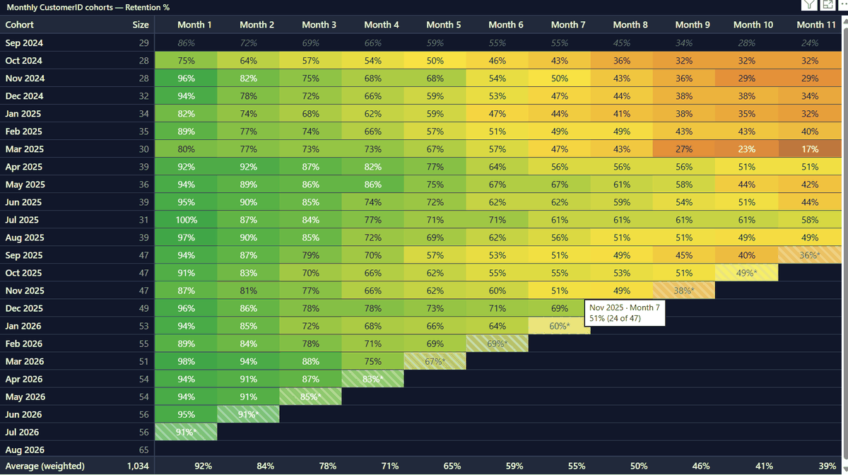
The retention triangle that product teams get from Mixpanel and Amplitude — computed live inside Power BI, from your own model, with nothing pre-aggregated and nothing leaving your tenant.
Straight to the point: what it does · what it doesn’t
What it answers
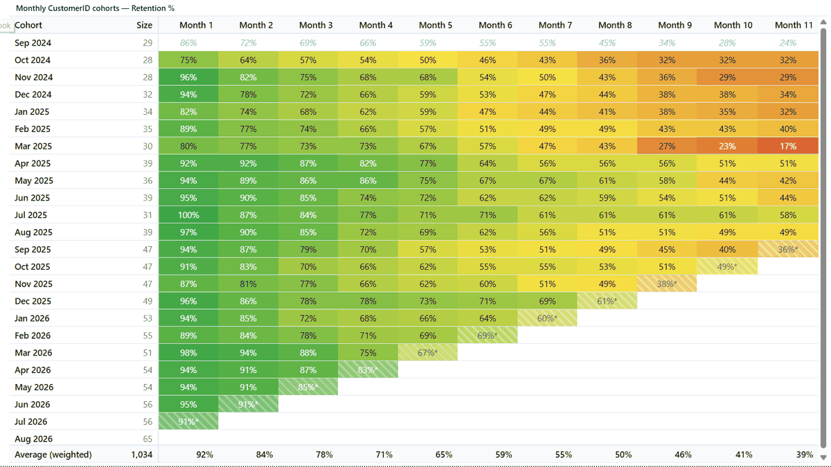
Group customers (or SKUs, machines, patients, employees…) by when they started, then track what share is still active 1, 2, 3… periods later. Reading down a column compares generations: are customers won this quarter stickier than the ones won a year ago? That question is nearly impossible in native Power BI — it is the whole point of this visual.
| Cohort | Size | M1 | M2 | M3 | M4 |
|---|---|---|---|---|---|
| 2026-01 | 412 | 46% | 38% | 33% | 21% |
| 2026-02 | 385 | 51% | 44% | 35% | — |
| 2026-03 | 430 | 58% | 47% | — | — |
| 2026-04 | 398 | 61%* | — | — | — |
Features
- ●Computed live from raw events. Drop in an entity, an event date and (optionally) a value — first activity, cohort assignment and the whole matrix are calculated in the visual. No DAX, no calculated tables.
- ●Every grain. Day, week, month, quarter and year cohorts — with a fiscal year start setting for quarter and year.
- ●Two retention definitions. Classic (“active in exactly that period”) and unbounded (“active in or after”), the same choice the dedicated analytics tools offer.
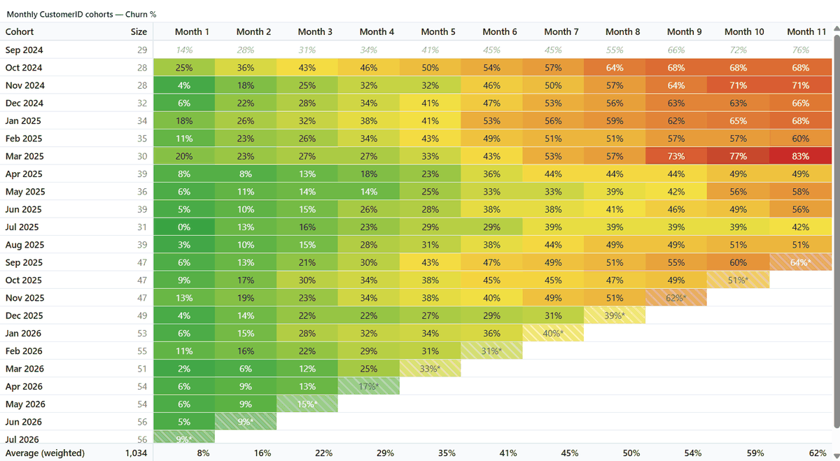
- ●Retention or churn. One toggle flips the matrix to churn — and the color scale flips with it, so high churn is never accidentally green.
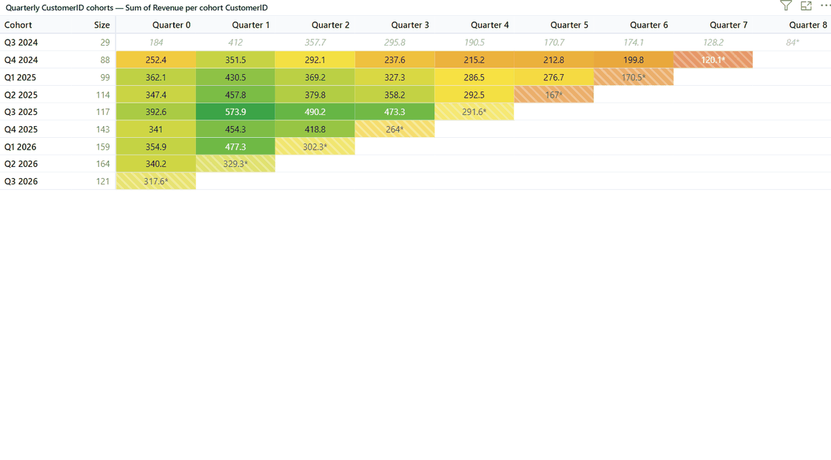
- ●Three metrics. Entity count / retention %, value sum, and value per cohort entity — the honest way to compare revenue across cohorts of different sizes.
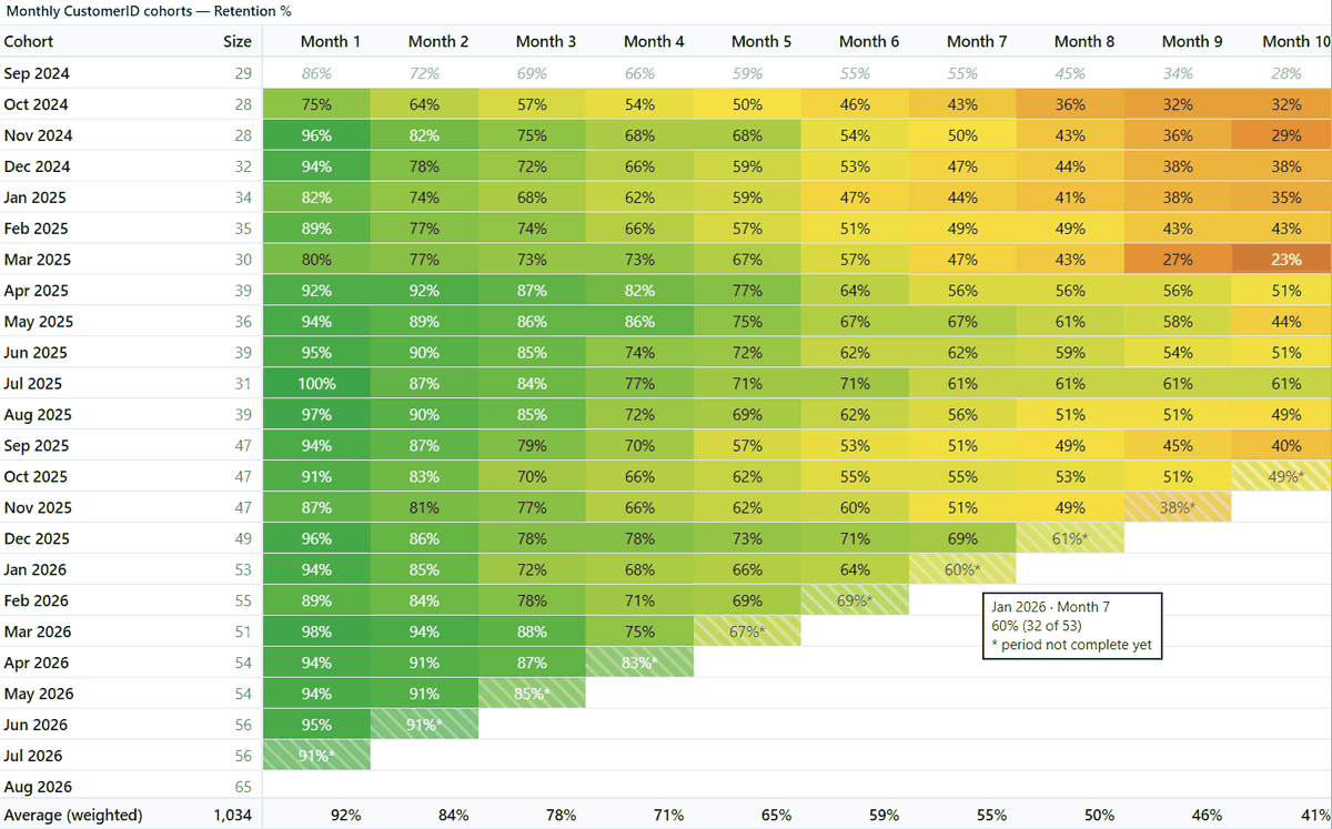
- ●Honest incompleteness. Future cells are blank, the current period is hatched and starred — never a fake 0%. A “complete periods only” switch hides partials entirely.
- ●Window-edge protection. The first cohort of any filtered window is inflated by definition; it is excluded from color scaling by default (with a toggle), so your heatmap isn’t lying.
- ●Cohort date override. Supply your own cohort date (e.g. product relaunch date) and analyze retention since that event — SKU relaunches, re-onboarding, campaign cohorts.
- ●Weighted averages. The averages row weights by cohort size and uses complete cells only — the statistically defensible version.
- ●Trustworthy color. Curated palettes plus a full custom 3-color gradient; scale across the matrix or within each row (the Mixpanel-style view); dark mode throughout.
- ●Pre-computed mode. Already have cohort numbers from SQL or DAX? Feed cohort key, period index, retained count and cohort size directly.
- ●Smart caption. The header writes itself from your fields and settings — entity, grain, metric, definition — so the chart is self-documenting in exports.
Honest limitations
We would rather you know these before you buy than after.
- Cohorts are computed from the data loaded into the visual. If a report filter hides early history, an entity’s “first event” shifts — which is why the first cohort of a window is treated as inflated and excluded from coloring by default.
- Row limit: 300,000. Above that a clear warning appears. The fixes are easy — use month-grain date keys instead of daily timestamps, add a measure so Power BI doesn’t cross-join dimensions, or switch to pre-computed mode.
- Pre-computed mode can’t know completeness. Hatching of partial periods and value metrics are only available in raw-events mode.
- Date hierarchies aren’t supported in date wells. Use the plain date column (the visual detects the hierarchy and tells you exactly what to do). Text keys like “2024-09” work natively.
Learn cohort analysis properly
The Cohort Matrix tutorial teaches cohort analysis from zero — how to read the triangle, classic vs unbounded retention, why the first cohort lies — then walks through every setting with a sample dataset you can download.
Questions about Cohort Matrix?
Pricing, a feature you need, whether it fits your model — ask, and a person who wrote it answers within two business days. It is in AppSource certification now.