Custom visual
Control Charts Pro Coming to AppSource
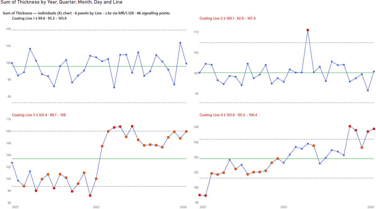
Statistical process control across every line, ward, site or product at once — one faceted grid instead of forty copy-pasted charts.
Straight to the point: what it does · what it doesn’t
Why this exists
A control chart answers the question every operational meeting actually asks: is this change real, or is it noise? Power BI has no control chart. The free ones handle a single series, so monitoring twenty wards means twenty charts, twenty sets of limits, and twenty places to make a mistake. Native small multiples has not changed since November 2022 — bar, column, line and area only, capped at thirty-six panels, one facet field, and the service still forces a shared Y axis.
Features
- ●Small multiples, done properly. One chart per panel value, with limits recalculated inside each. Auto or fixed columns, panels that scroll past the viewport, and four Y-axis modes: free per panel, shared across all, shared within a row, or shared within a column. Free-per-panel compares behaviour; shared compares level. Most tools force one and call it a feature.
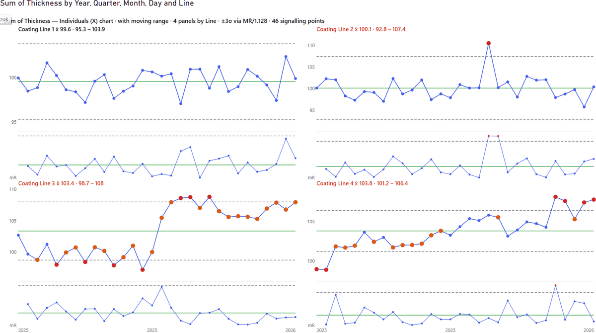
- ●Every chart type that matters. Individuals (X), XmR with the moving-range chart underneath, run charts, and the attribute charts — P, C and U — with limits that correctly vary point by point as the denominator changes.
- ●Sigma your way. Estimated by MR̄/1.128, median-MR/0.954 or sample SD — your choice, named on the chart so a reviewer can reproduce it.
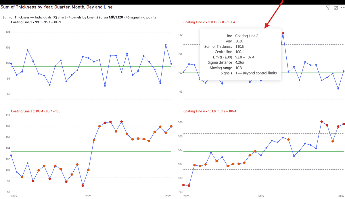
- ●Signals you can explain. Nelson rules 1–8 with configurable run lengths, or one click for the NHS Making Data Count seven-point rules, or WECO, or your own combination. Hover a flagged point and the tooltip names the rule in plain English.
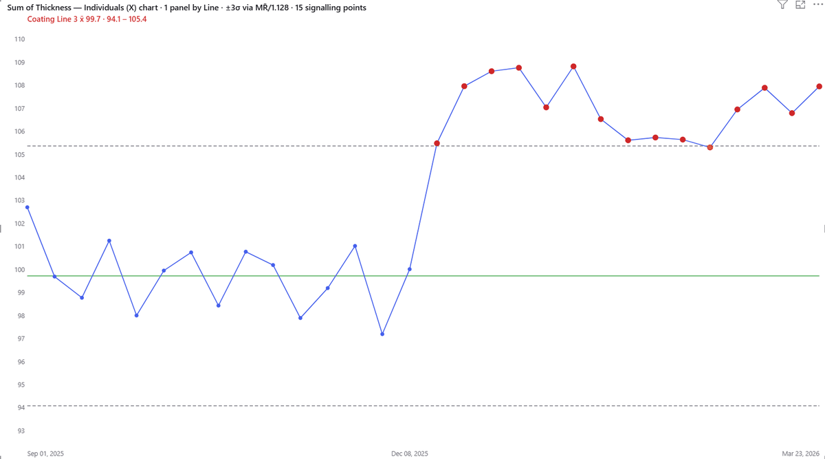
- ●Rebasing that tells the truth. Freeze limits after a baseline of N points, or let the visual detect a step change and split the series into phases with separate limits and a dashed boundary. Drop in a Phase field to control it explicitly. Limits calculated from a process that has already shifted are worse than no limits at all.
- ●Capability built in. Specification limits, target lines, and Cp/Cpk in the panel title.
- ●Panel sorting. Order panels by name, by mean, by steepest trend, or most-violations-first — so the panel that needs attention is the one you see.
- ●Verified against an independent implementation. Every centre line, sigma estimate, control limit, rule hit and moving-range limit was checked against a clean-room implementation built from textbook formulas, on datasets with a planted spike and a planted step change.
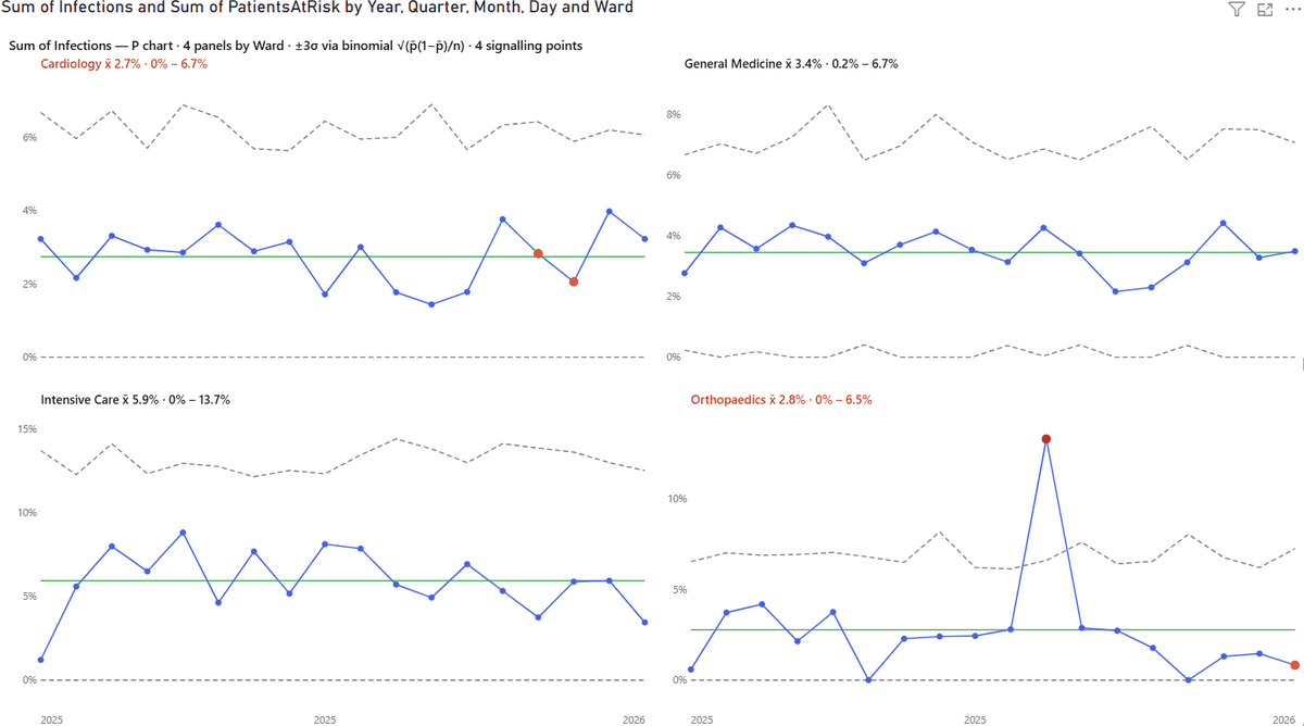
Where it fits
NHS and healthcare quality indicators, manufacturing process control, turnaround and SLA times, infection and incident rates — any measure where you need to stop reacting to noise.
Honest limitations
We would rather you know these before you buy than after.
- One measure per visual. Multi-measure panels are planned, not shipped.
- The X axis is ordinal. Points are equally spaced rather than placed on a true time scale. This matches standard SPC practice, where the subgroup is the unit — but it means gaps in time are not drawn as gaps.
- X labels show first, middle and last per panel so a grid stays readable.
- Rules 4, 7 and 8 need long series and will rarely fire on short ones.
- Cp/Cpk needs at least one specification limit and an individuals-type chart.
Questions about Control Charts Pro?
Pricing, a feature you need, whether it fits your model — ask, and a person who wrote it answers within two business days. It is in AppSource certification now.