Custom visual
Statistics Suite Coming to AppSource
Five statistical charts Power BI doesn’t ship — box plots, violins, beeswarm, histogram and a correlation matrix — in one visual, with statistics you can defend in a meeting.
Straight to the point: what it does · what it doesn’t
Why this exists
Microsoft removed its own Histogram visual in 2022, along with the Percentile Chart. There is no correlation matrix on AppSource at all, because the only one there ever was is an R visual — and R visuals can never be certified. The box plots that remain are largely unmaintained, and several quietly sample your data at 30,000 rows without telling you. This visual replaces all of them.
Features
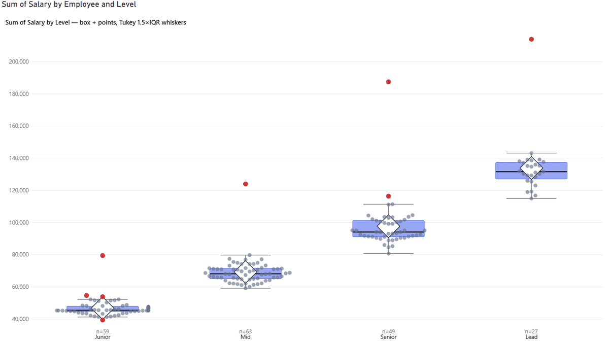
- ●Box plots that name their method.
Quartiles by Tukey hinges, Excel’s
QUARTILE.INC, orQUARTILE.EXC; whiskers by k×IQR, min–max, percentiles or ±k·SD. The active method is named in the tooltip, so nobody has to guess why your numbers differ from someone else’s. - ●Validated against Excel.
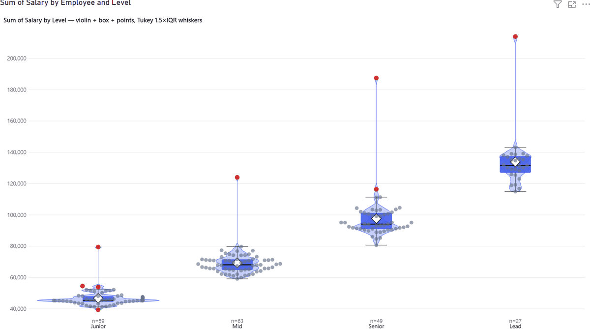
QUARTILE.INC,QUARTILE.EXC,MEDIAN,AVERAGE,STDEV.SandCORRELall match to the precision shown — plus Spearman againstRANK.AVG. - ●Real violins. Genuine kernel density estimation (Epanechnikov or Gaussian) with Silverman’s bandwidth rule and a manual override — not a smoothed histogram pretending to be a density.
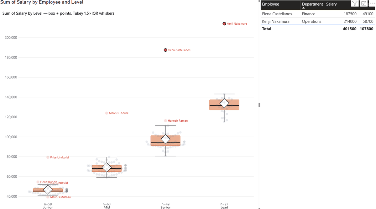
- ●Every point, clickable. Beeswarm or deterministic jitter, all points or outliers only. Clicking a point cross-filters the rest of your report, so an outlier becomes a question you can answer: which employee, which order, which batch.
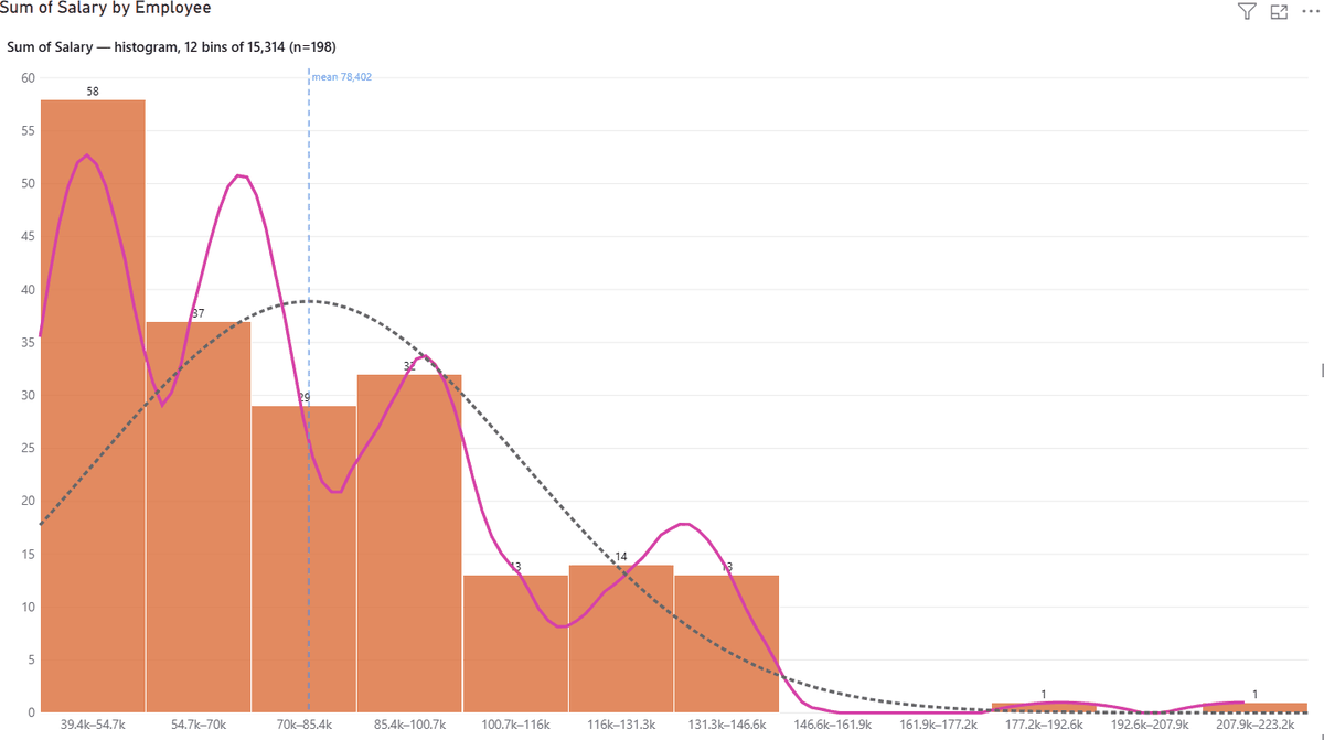
- ●Histogram. Freedman–Diaconis or Sturges bins, or set the count or width yourself. Count, percent or density normalization, with KDE and fitted-normal overlays that stay scale-correct in all three. Cumulative and Pareto lines, reference lines at mean, median, ±kσ or any values you type.
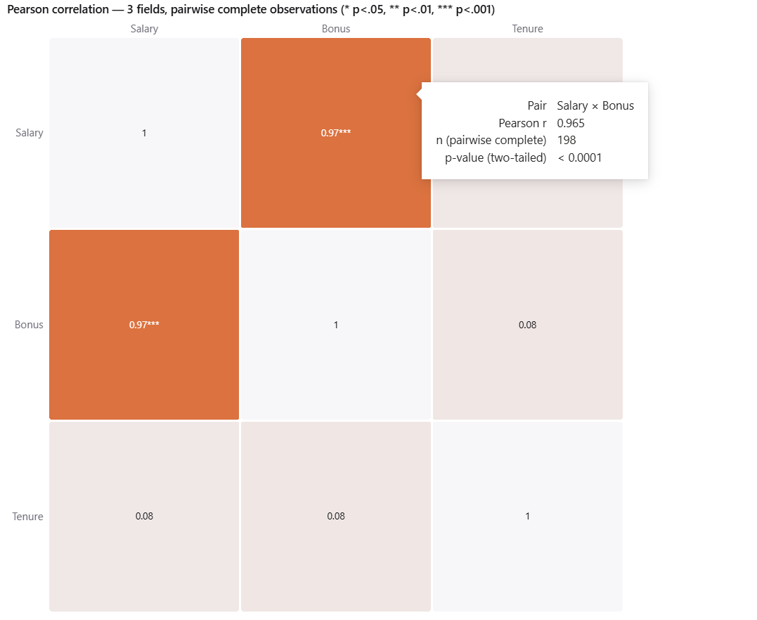
- ●Correlation matrix. Pearson or Spearman, computed natively with two-tailed p-values, significance stars, pairwise complete-case handling and a diverging colour scale.
- ●No silent sampling. Free box-plot visuals stop at 30,000 rows. R and Python visuals are hard-capped at 150,000. Statistics Suite loads to the Power BI platform maximum — and when the platform refuses more data it says so in a banner on the chart, instead of quietly showing you a wrong median. Tested to 600,000 rows.
- ●A format pane that stays out of the way. Fourteen small cards that show and hide with the chart type, so you never scroll past violin settings to find histogram bins.
Where it fits
Strongest in HR compensation review — box plot, points, and click an outlier to see who. Also process capability, lab and quality data, survey analysis, and any “is this difference real?” question.
Honest limitations
We would rather you know these before you buy than after.
- Distribution and histogram use the first Values field. Extra fields feed the correlation matrix. Add two or more for correlation mode.
- The legend is ignored in histogram mode. Split violins, notches and confidence intervals, and small multiples are planned, not shipped.
- Column format strings aren’t applied yet to axis and label numbers.
- Above 50,000 values per group the violin curve is integrated over a quantile-spaced sample. Bandwidth and every reported statistic still use every row — only the drawn curve is approximated.
Questions about Statistics Suite?
Pricing, a feature you need, whether it fits your model — ask, and a person who wrote it answers within two business days. It is in AppSource certification now.