Custom visual
Org Chart Pro Coming to AppSource
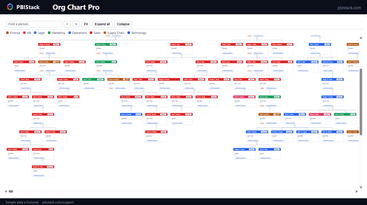
Turn a flat employee/manager table into a clean organization chart that never overlaps — at any depth, at any size. Photos, open positions, dotted-line reporting, tenure and cost rollups built in, and honest reporting when your HR extract has problems instead of silently dropping people.
Straight to the point: what it does · what it doesn’t · the tutorial
Features
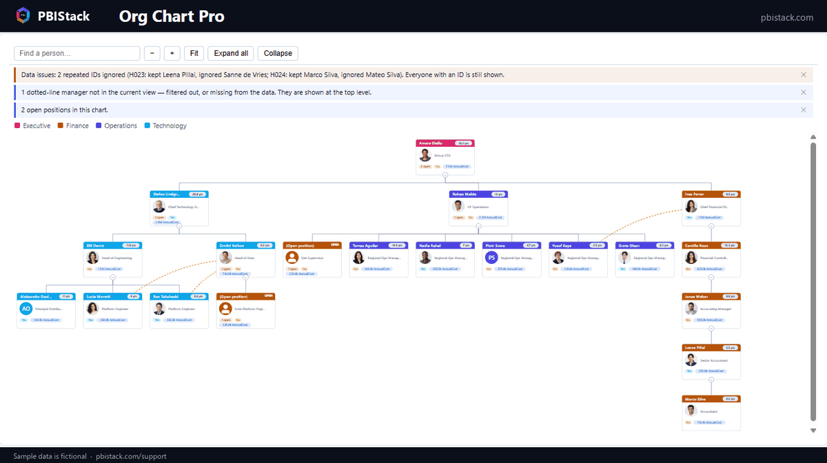
- ●Never overlaps. A proper tidy-tree layout keeps every card clear at any depth, top-down or left-to-right — the #1 complaint against every other org chart visual.
- ●Honest about data quality. Reporting loops, self-references and duplicate IDs are detected, named in plain language and shown — never silently dropped. People whose manager is filtered out stay on the chart.
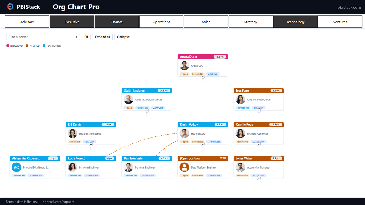
- ●Open positions. Flag unfilled roles, mark them with a tag, and see open headcount rolled up every branch — a collapsed manager still shows what's open underneath.
- ●Matrix organisations. Dotted-line reporting drawn dashed and clearly distinct from the hierarchy — without ever changing the tree or the numbers.
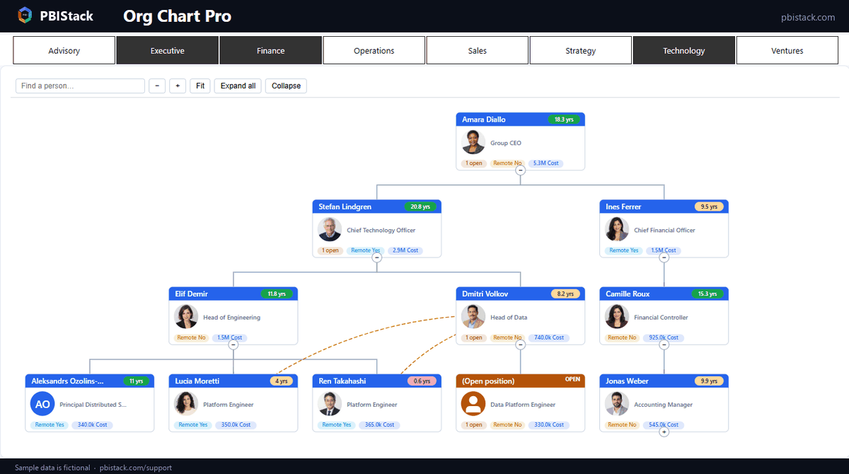
- ●Tenure, live. Worked out from the start date at render time, so it stays correct as time passes. Shown as a pill on every card, sortable, with new-joiner and long-service highlighting.
- ●Cost & value rollups. Every manager's card can show what their whole organisation costs — no DAX required.
- ●Photos done right. URLs or embedded images; coloured initials for people without one; depth rules so a 5,000-person chart shows photos only where they carry meaning.
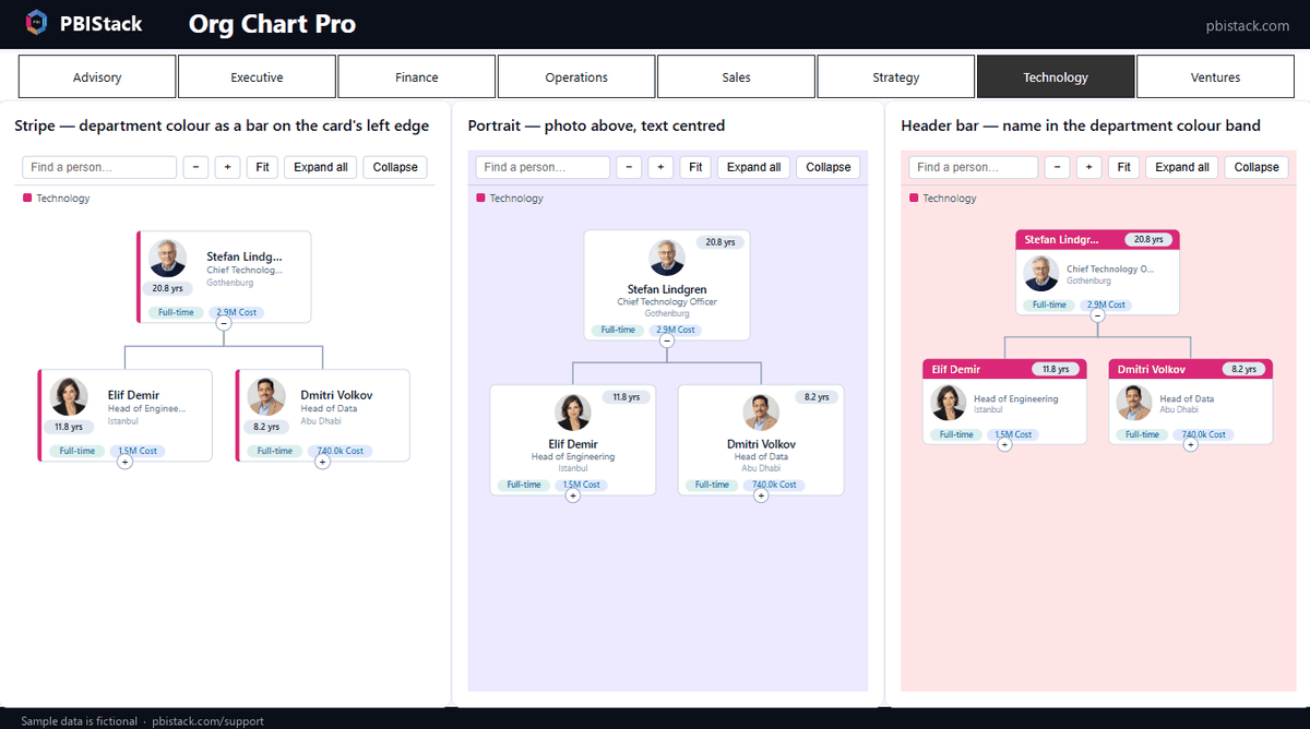
- ●Six card designs. Header bar, classic, stripe, portrait, overlapping photo and compact — every one fully colourable. Pick a department and give it its own colour; the key above the chart follows.
- ●Job shares. Two people holding one position stay one node — names joined, numbers summed.
- ●Built for large orgs. Loads beyond Power BI's default row window and draws only what's on screen, so a 10,000-person chart pans smoothly.
- ●First-class Power BI citizen. Cross-filtering both ways, search with auto-expand, twelve sibling sort orders, and the view you left — zoom, scroll, collapsed branches — restored when you return to the page.
- ●Tells you which build you are on. A landing page names the fields it needs before any data is bound, and the format pane ends with an About card carrying the version — so an update never leaves you guessing.
Honest limitations
We would rather you know these before you buy than after.
- Rows where every measure is blank never reach the visual. Power BI removes them in the query — it affects every custom visual. Keep one always-filled measure (headcount or FTE) in the Value field so open positions can't vanish this way.
- Photo URLs load only from sources your tenant allows. Certified visuals cannot call external services, so pictures come from your data — URLs your environment can reach, or images embedded as data URIs, which always work.
- An empty visual can't be dragged by its body. Until fields are added, move it by its header strip — a Power BI host behavior for visuals with landing pages.
- Date hierarchies are refused, on purpose. A Start date dropped in as a hierarchy arrives as separate year/quarter/month columns; the visual warns and leaves tenure blank rather than inventing a number. Use the plain date column.
- More than ten groups share automatic colours. Ten groups can carry their own chosen colour; beyond that, groups keep a stable automatic colour that may repeat.
Getting started
Two fields make a chart: Employee ID and Manager ID. The Org Chart Pro tutorial walks through the rest — open positions, dotted lines, tenure, cost rollups, card designs and how imperfect HR data is handled — with a sample dataset to follow along.
Questions about Org Chart Pro?
Pricing, a feature you need, whether it fits your model — ask, and a person who wrote it answers within two business days. It is in AppSource certification now.