Tutorial
Control charts in Power BI, from first chart to confident signals
This guide explains what a control chart tells you, then walks through every setting of Control Charts Pro that matters, with two sample datasets you can download and follow along with.
1. What a control chart tells you
Every process varies. A control chart separates the ordinary variation you should leave alone from the signals worth acting on. It draws your values in time order, a centre line at their average, and control limits three standard deviations either side, worked out from the data itself. A point outside the limits, or a pattern that chance rarely produces, is a signal. Everything else is noise, and reacting to noise makes a process worse.
2. Quick start
- Value = the number you measure, for example
Thickness. - Point (X axis) = what orders the points, for example
Week.Use the plain date field, not the Year / Quarter / Month / Day hierarchy; the visual asks for the plain date if it gets the hierarchy. - Panel (small multiples) = optional: one chart per line, ward or site, each with its own limits.
- Denominator is needed for P and U charts only. Phase / baseline and Tooltips are optional.
Chart type is the first card of the format pane. “Show advanced settings” in that card reveals the rest; the essentials are visible without it.
3. How the limits are calculated, and how to check them
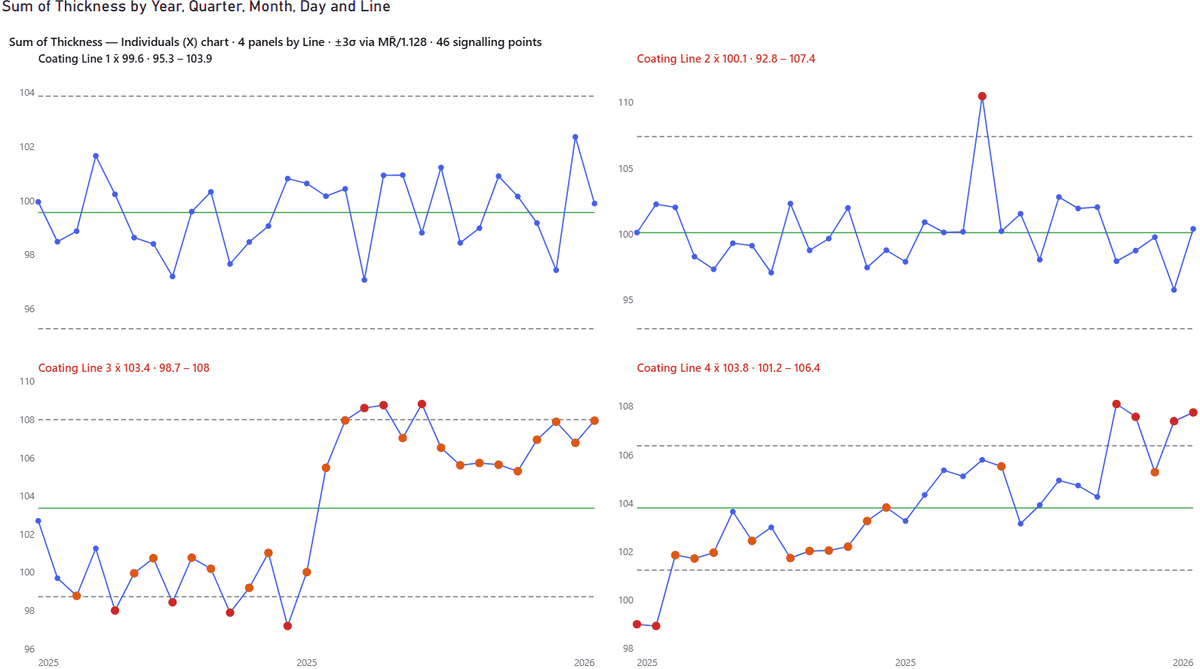
For an individuals chart the limits are the mean ± 3 sigma, and sigma comes from the moving ranges, the differences between consecutive points, not from the overall standard deviation. That is what makes the limits robust to the very shifts you are trying to detect.
- Sigma estimate (Control limits card): the standard average moving range divided by 1.128, the median moving range, or the sample standard deviation.
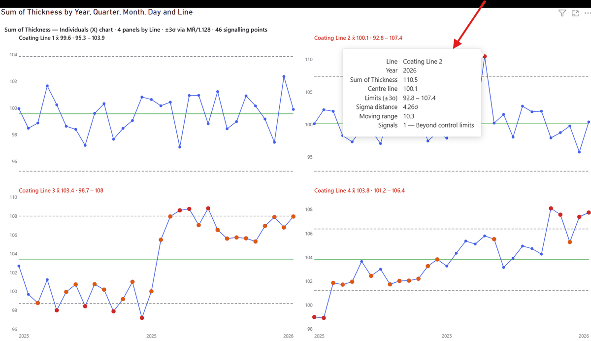
- Screen extreme moving ranges (on by default). One spike creates one or two huge moving ranges, which widen the limits until the spike itself no longer signals. With the screen on, moving ranges above 3.5 times the average are left out of the estimate. It is the default in the NHS and QI Macros tools, and the caption says “screened” when it is on. Turn it off to match Minitab or a hand calculation. In the sample, Coating Line 2 reads 94.32 to 105.95 with the screen and 92.83 to 107.43 without it.
- Limits at ± k sigma, the 1σ and 2σ zones, a minimum number of points before limits are drawn, and “never draw a negative lower limit” are in the same card.
- Dashed limits are provisional: fewer than 20 points stand behind them, and the caption says so.
4. Signals, and rules you can name
Red markers are beyond a control limit. Amber markers are inside the limits but part of a pattern chance rarely produces. The key at the end of the caption says which is which, and the tooltip names every rule that fired.
- Rule sets (Detection rules card): NHS / Making Data Count (the default: a point beyond limits, a run of seven on one side, a trend of seven, two of three near a limit), Nelson 1–8, WECO basic, or Custom with a switch and a run length for each rule.
- Why not all eight Nelson rules by default? Each rule adds false alarms. With all eight on, a perfectly stable process signals often. Use them when you know you need them.
- The eight rules by name: beyond control limits · run on one side of centre · steady trend · alternating pattern · 2 of 3 beyond 2 sigma · 4 of 5 beyond 1 sigma · hugging the centre line · avoiding the centre line.
- Improvement direction (Chart type card): say whether higher or lower is better and signals read as improvement or concern, with the variation and assurance icons of NHS Making Data Count in each panel title.
5. XmR: the moving-range chart
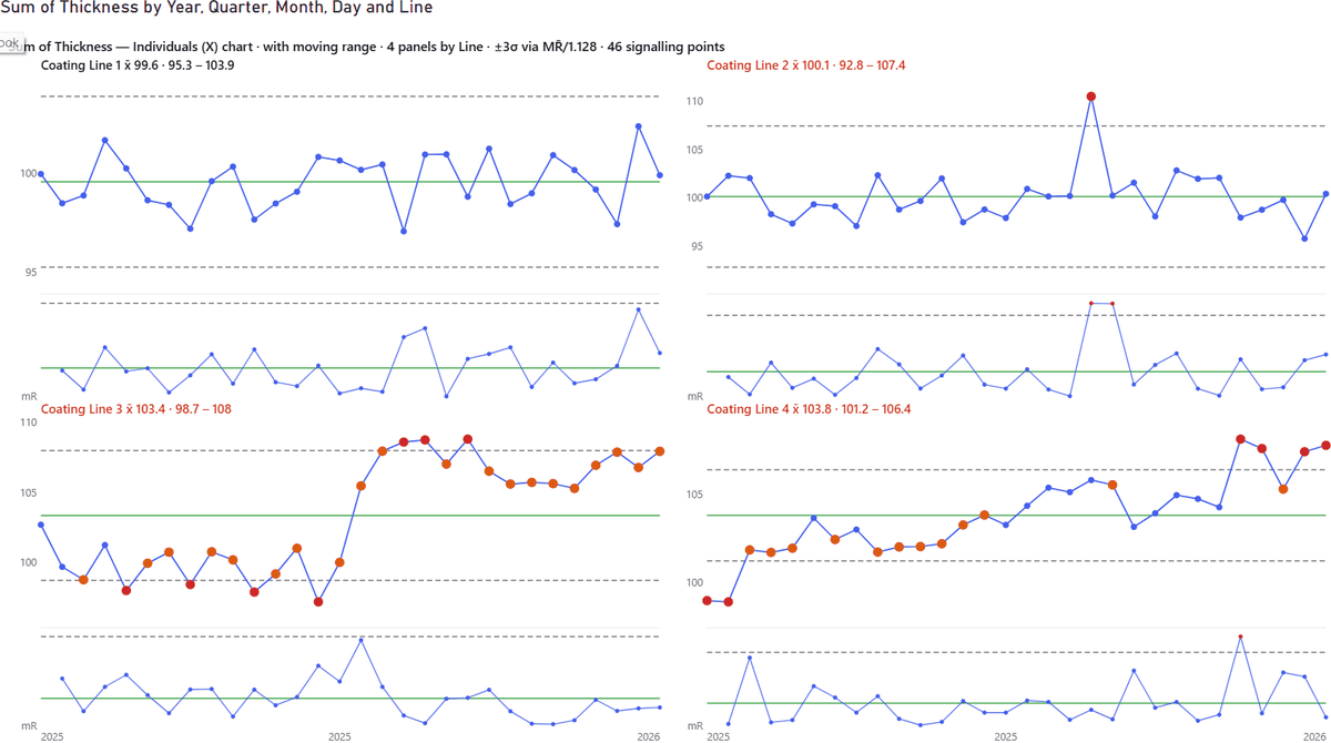
Switch on Add moving-range chart (XmR) and a strip appears under each panel showing the point-to-point changes with their own limit. It answers a different question: not “is the level unusual?” but “was this jump unusual?”. A single spike shows as two consecutive breaches, one jump up and one back down, which tells you it was one event and not a shift.
6. When the process really changes: baselines and rebasing
Limits calculated from all the data absorb a real change and hide it. Two tools deal with that.
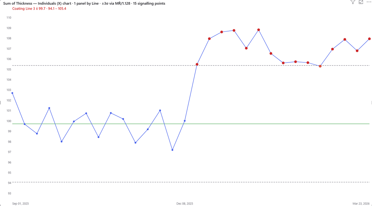
- Freeze limits after N points (Control limits card) calculates the limits from a baseline period and holds them. In the sample, Coating Line 3 frozen on its first 15 weeks reads centre 99.73 with limits 94.09 to 105.37, and 14 of the next 15 points sit above the upper limit.
- Recalculate limits after a step change (Rebasing card) starts a new phase with its own limits when a sustained shift is detected. Choose the trigger, and mark the phase boundary with a vertical line. After rebasing, each phase is judged against its own level.
- A Phase / baseline field does the same by hand: every value of that field is its own phase, for example before and after a documented change.
7. Counts and rates: P, C and U charts
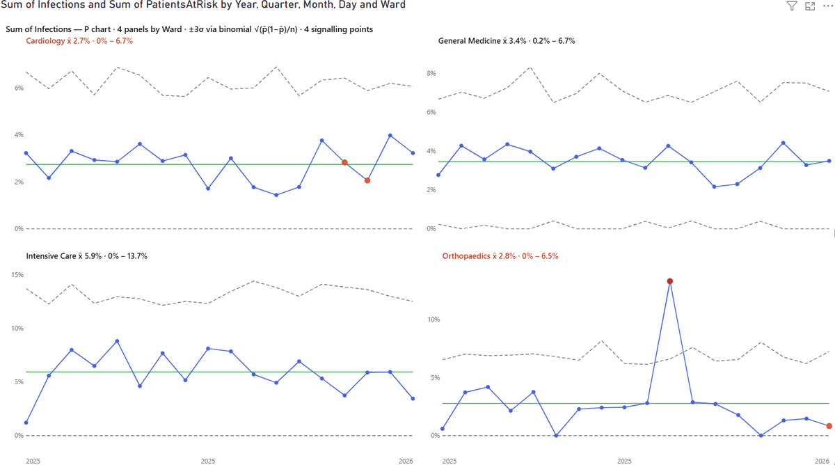
- P chart: a proportion, such as infections out of patients at risk. Put the count in Value and the sample size in Denominator. The limits step from point to point because a month with fewer patients deserves wider limits.
- U chart: a rate per unit, such as defects per metre, also with a Denominator. C chart: plain counts from samples of constant size. Run chart: the points and the centre line, no limits.
- Without its Denominator a P or U chart does not draw; the visual asks for the field instead.
8. Panels, axes and text
- Panels card: columns, panel order (including Most violations first, which puts the panel with the most signals on top), panel titles with the centre and limits, and a minimum panel height; when the panels do not fit, the grid scrolls rather than squashing.
- Y scale (Axis card): free per panel, or shared across all panels, per row or per column. A scale shared along a row draws one axis per row and gives every plot the same width.
- Spec limits (advanced): lower and upper specification limits, a target, and Cp / Cpk per panel. Specification limits are what the customer needs; control limits are what the process does. They are different lines and the visual draws them differently.
- Text: Axis font size and colour, panel title size, and for the caption its own size, colour, weight and the gap beneath it, plus one font family for the whole visual. Tooltips keep the precision of your data even when the axis rounds for space.
Something not covered here?
Ask — the answer usually ends up back in this tutorial.