Tutorial
Org Chart Pro in fifteen minutes
From a flat employee table to a finished organization chart: the two fields it needs, the optional ones worth adding, how it handles imperfect HR data, and every setting explained. Follow along with the sample dataset (29 people, one fictional company, with an open position, a dotted line and a job share already in it).
1. Quick start
- Add the visual to a report page.
Once it is on AppSource: Visualizations → Get more visuals → search “Org Chart Pro”. Until then, import the
.pbivizfile you received. - Drop
EmployeeIDinto Employee ID andManagerIDinto Manager ID.That is the whole hierarchy. The person whose manager is blank becomes the top. Any unique key works — employee number, work email. If your table has only names, put the name in Employee ID and the manager's name in Manager ID; it works, but two people with the same name will merge. - Add
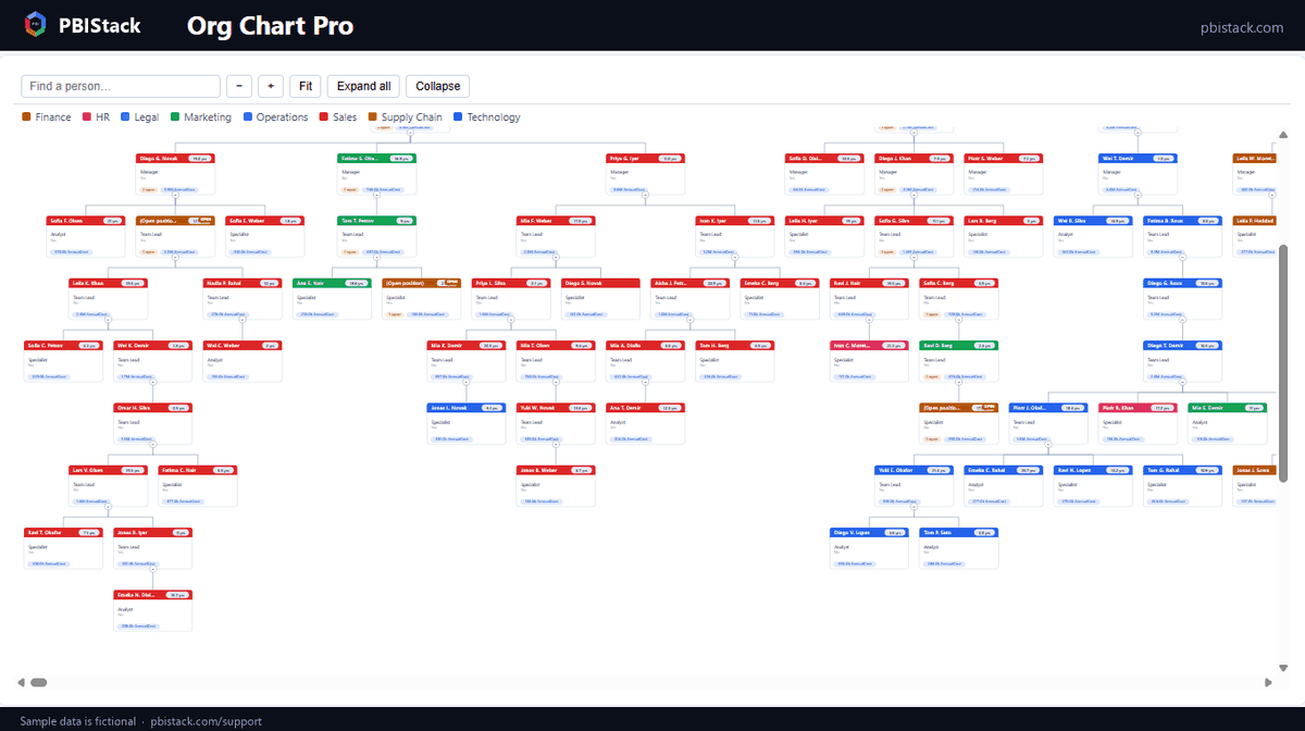
NameandJobTitle.The two lines on every card. AddDepartmentto Group (colour by) and every card takes its department's colour, with a key above the chart. - Look at the banners before you look at the chart.
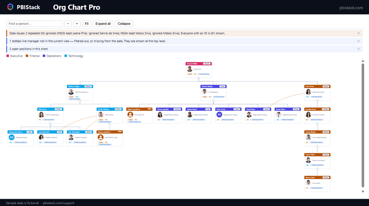
If the extract has a problem — someone reporting to themselves, a loop, a repeated ID, a row with no ID — the visual says so in plain words at the top, and keeps everyone on the chart. Nothing is dropped without telling you.
2. The fields
| Field well | What goes in | Notes |
|---|---|---|
| Employee ID | The unique key per person. | Required (or key on Name — see above). Blank IDs are reported in the banner, not drawn. |
| Manager ID | Who they report to, in the same terms as Employee ID. | Required. Blank = a root. A manager who is filtered out of the view leaves the person at the top level with a note — not deleted. |
| Name | The main line of the card. | Falls back to the ID if empty. |
| Job title | The second line. | Optional. |
| Group (colour by) | Department, location, band — anything categorical. | Colours the card accent; adds the colour key. Each group's colour can be overridden in Card design. |
| Photo URL | An image URL or a data URI. | People without one get coloured initials. URLs must be reachable from your tenant; embedded data URIs always work. |
| Value | A number per person: FTE, headcount. | Rolled up through the tree. Also the field that keeps rows alive — see the data note in section 8. |
| Cost / budget | Salary, budget, headcount cost. | Summed down every branch, so a manager's card can show what their organisation costs. |
| Open position flag | Any true / 1 / “Yes”. | Marks an unfilled role. Open headcount rolls up and shows on every manager above it. |
| Start date | Hire date. | Tenure is worked out at render time. Use the plain date, not a date hierarchy. |
| Dotted-line manager | A second reporting line. | Drawn dashed. Never changes the tree or the numbers. |
| Badges (flags & KPIs) | Several allowed. | Each becomes a labelled pill on the card — Remote, Contractor, a rating. |
| Card details | Extra lines on the card. | Location, cost centre. |
| Tooltips | Extra fields on hover. | Anything you don't want on the card face. |
3. Open positions and cost
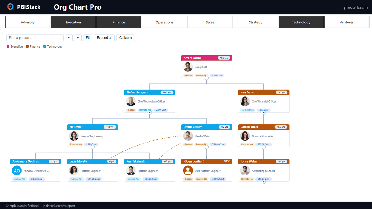
Add IsVacant to Open position flag and AnnualCost to
Cost / budget. Unfilled roles get a tag (or a dashed outline, or a tinted card —
Format → Open positions → How) and a “1 open” pill appears on every manager above
them, so a collapsed branch still shows what is open underneath. Switch on
Span of control → Cost rollup and each manager's card carries the cost of their
whole organisation. No DAX needed: the rollups are computed by the visual from the rows
in view, and change with your slicers.
4. Matrix reporting and tenure
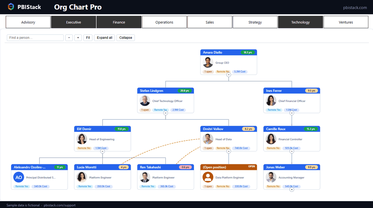
Put the second manager's ID in Dotted-line manager and the relationship is drawn as a dashed curve between the two cards — visibly different from the hierarchy, and never counted in any rollup. Put the hire date in Start date and tenure appears as a pill at the right of each card's header (11.7 yrs), or after the name if you prefer; Format → Tenure chooses the format, highlights new joiners under N months or long service over N years, and Sort can order siblings by it.
5. Card designs and colours
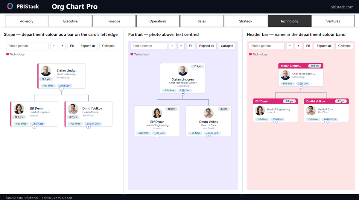
Format → Card design → Design offers six layouts: Header bar (name in a colour band — the default), Classic (photo left), Stripe (a thin colour bar on the left edge), Portrait (photo above, centred), Overlap (round photo on the card edge) and Compact (text only). Every design is a template, not a palette: canvas, card background, accent, border, corner radius and text colours are all yours. With Colour the accent by Group on, choose a group in Group to colour and pick its colour below; All groups sets one colour for every group in view, and the picker's Reset to default returns a group to its automatic colour.
Photos decides who gets one: everyone, managers only, or just the top levels — so a 5,000-person chart shows photos where they carry meaning and stays quick. Shape and size apply to every design that shows a photo.
6. Getting around a big chart
- ●Toolbar: zoom in and out, Fit the whole tree to the visual, Expand all / Collapse. Format → Layout → Expand to level sets how deep the chart opens by default.
- ●Search: type a name and the branch holding it expands and scrolls into view.
- ●Direction: top-down or left-to-right (Layout → Direction). Card width, height and the gaps are yours to set; the layout keeps every card clear of its neighbours whatever you choose.
- ●Sort: twelve sibling orders — name, job title, group, team size, value, cost, tenure, open positions first.
- ●The view is remembered: zoom, scroll position and collapsed branches are saved with the report and restored when you come back to the page.
- ●Cross-filtering: click a card to filter the rest of the page; Ctrl-click for several; click empty canvas to clear. Slicers filter the chart, and people whose manager falls outside the slicer stay visible at the top level with a note saying why.
7. When the data is imperfect
HR extracts have problems, and an org chart that hides them is worse than none. Format → Data issues controls what happens:
| Setting | What it does | When to change it |
|---|---|---|
| Problem records | Show everyone (default), hide people with problems, or show only them. | “Show only” is a handy audit view to send back to HR. |
| Repeated Employee IDs | Report the repeat and keep the first row, or merge the rows into one node (a job share). | Merge when two people genuinely hold one position — names are joined, numbers summed. |
| Report data issues | The banner naming loops, self-references, repeated and missing IDs. | The ✕ on the banner switches this off for the report; switch it back on here. |
| Note people outside the view | The note for people whose manager is filtered out. | Turn off on pages where a department slicer makes this expected. |
| Mark affected cards | Dashed amber border on the people involved. | Leave on: it is how a reader finds them. |
8. Good to know
- Rows where every measure is blank never reach the visual. Power BI removes them in the query, for every custom visual. Keep one always-filled number (headcount, FTE) in Value so an open position with no cost cannot vanish this way.
- Use plain date columns. A date hierarchy in Start date arrives as separate year/quarter/month columns; the visual warns and leaves tenure blank rather than computing “56 years since 1970”.
- Large organisations load beyond Power BI's default 30,000-row window (Display → Row limit) and only the cards on screen are drawn, so a 10,000-person chart pans smoothly. Photos for the top levels only keep it that way.
- Photo URLs load only from sources your tenant allows. A certified visual makes no external calls of its own; the images come from your data.
- Empty visual: until fields are added, Power BI only lets you move it by its header strip.
- Which build am I on? The last card of the format pane reads About · v…; a report keeps the build it was saved with, so check it after an update.
Something not covered here?
Ask — the answer usually ends up back in this tutorial.