Tutorial
Radar charts in Power BI that say what they mean
A radar chart is easy to draw and easy to misread. This guide explains the choices that decide whether yours tells the truth, then walks through every setting of Radar & Polar Pro that matters, with two sample files you can download and follow along with.
1. What a radar chart is good for
A radar draws one spoke per category and one shape per thing you compare. It is good at one job: showing the profile of a few things across five to seven dimensions at a glance, and whether each dimension reached its target. It is poor at exact comparison and poor past about seven spokes, and the visual warns you when you go beyond the number you choose.
2. Quick start
- Values = the number, for example
Value. This is the only required field. - Axis = one spoke per value of this field, for example
Metric.No Axis field? Put several measures into Values and each measure becomes a spoke. No unpivoting, no DAX. - Legend = optional: one shape per value, for example
Quarter. - Target = optional: the target for each spoke. Tooltips adds fields to the tooltip.
3. The radial scale: the decision that matters most
Format pane, Radial axis card, Scale. There are three choices, and each one answers a different question.
- One scale for all spokes (the default). Every spoke uses the same axis, from zero to the largest value. This is how readers expect a radar to work, and it is the only scale on which the area of a shape means anything. Use it when every spoke is in the same unit: scores out of 10, percentages, ratings.
- Each spoke its own range. Every spoke runs from zero to its own largest value (or its target, if that is larger). Use it for mixed units. The shapes then show relative position on each spoke; the spokes are not comparable with each other, the ring labels turn into percentages of the spoke, and a note on the chart says so.
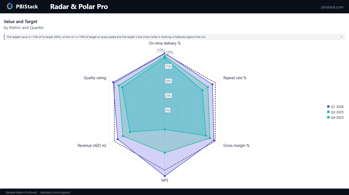
- Percent of each spoke's target. Every spoke is scaled by its own target, so the target is one circle and equal distance from the centre means equal percent of target. Use it for scorecards. It needs a Target field.
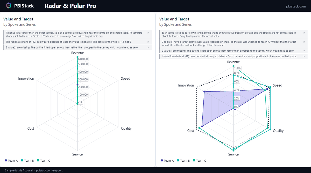
When one spoke dwarfs the rest on the shared scale, the chart does not switch scales behind your back. It tells you: in the team sample the note reads “Revenue is far larger than the other spokes, so 5 of 6 spokes are squashed near the centre on one shared scale” and names the setting to change.
4. A fixed business range for a spoke
Some measures have a range that does not depend on this month's data: NPS runs from −100 to 100, a rating from 1 to 5. In the Spoke scales card every spoke has a Fixed scale switch with a Minimum and a Maximum. A fixed spoke keeps its range through every slicer, in all three scale modes. A value outside a fixed range is drawn at the end of the spoke and reported in a note, never silently clipped.
5. Targets and the gap
With a Target field the Target card draws the target as an outline, a shaded band or markers. Two switches turn a picture into a finding:
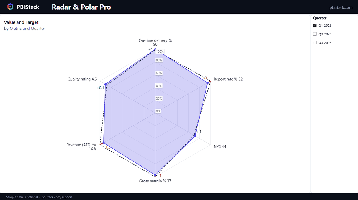
- Emphasise the gap draws the distance between value and target on every spoke, green where the target is met and red where it is missed. Label the gap adds the signed difference.
- Colour markers by pass/fail colours each point by whether it meets its target.
- The visual reads higher as better. A cost that is above its target would be coloured as met, so express such a measure the other way round (margin instead of cost) until direction-aware targets arrive.
6. Percent of target
On this scale the rings are labelled in percent of target and the target lies on the 100% ring of every spoke. If something beat its target, the rim moves out to that percentage on every spoke, so an overshoot is never flattened against the rim and 100% stays one circle. In the scorecard sample the rim is 110%, because NPS reached 44 against a target of 40.
7. Missing values, zeros and negatives
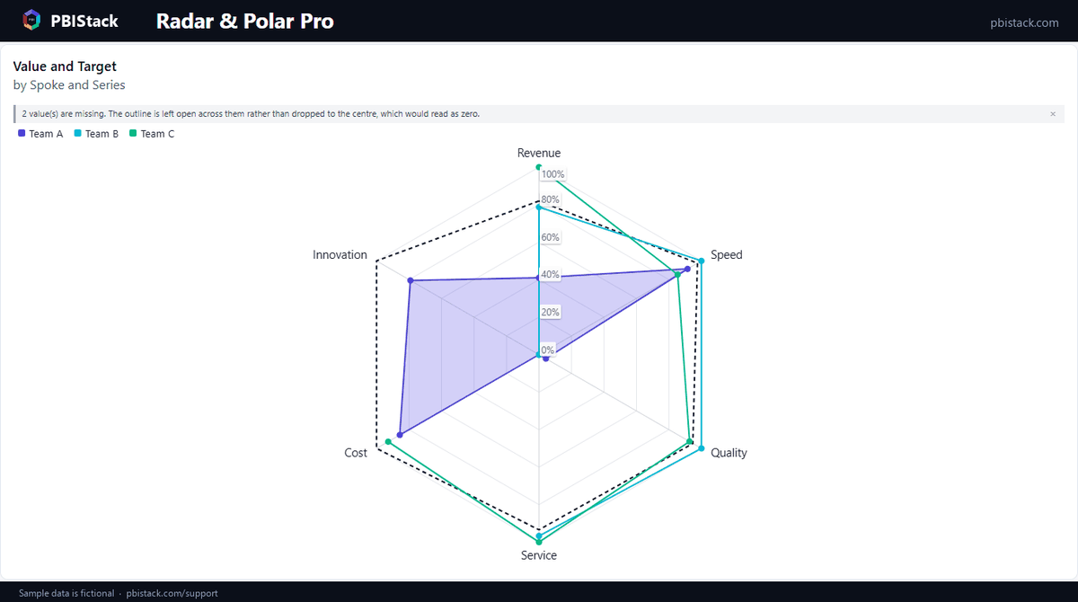
- A missing value is a gap. The outline is left open across it, and a note counts the gaps. The usual alternative, drawing the point at the centre, makes a missing value look like a zero. Data handling → Missing values offers the other two behaviours when you want them: Draw at the axis minimum (with a warning that it looks like a real reading) and Hide the whole shape (the note names the shapes it hid).
- A real zero is drawn, at the inner end of its spoke.
- A negative value moves the start of the axis below zero, and a note says the centre of the web is that value and not 0. On the percent-of-target scale, which starts at 0, a negative value is drawn at the centre and reported as lower than it looks.
- Logarithmic (Radial axis card) spreads values that span several powers of ten. Rings sit on round values: 1, 10, 100, 1,000. Zero and negative values have no logarithm; they become gaps, counted in a note.
8. Spokes that stay where they are
Spoke labels → Spoke order sorts the spokes by field order, by name or by value. Sorting by value has a catch: when a slicer changes the values, the spokes re-sort and the reader's mental map is gone. Pin the spoke order stores the order of that moment. From then on a filter changes the values and nothing else; a category that appears later is added at the end and reported.
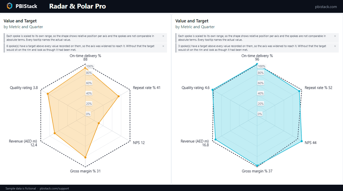
9. Reading and checking a number
- The tooltip gives the value as it is in your data, the series, the target, whether the target was met and by how much, and a Scale line that says how this spoke is scaled. Labels on the chart round for space; the tooltip does not.
- The notes above the chart say what the axis is doing: where it starts, what is missing, what cannot be shown, what was widened to reach a target. Data handling → Show notes on the chart switches them off for a finished report.
- Ring labels (Radial axis card) can be switched off, given a fixed number of decimals, a size, a colour and a background. Data labels put the value at every point.
10. Looks
- Grid: web or circles, grid and spoke colours, alternate ring shading, a web background, and a rotation in degrees.
- Shapes: line width, curved lines, fill and its opacity, marker shape, size and border. Shape colours gives every shape its own colour and line style.
- Spoke labels: size, colour, font, wrapping onto two or three lines, the gap from the web, and Append the value when there is one shape. The web grows to fill the space the labels leave.
- Legend: top, bottom or right, with an optional title. The last card of the format pane shows the build version.
Something not covered here?
Ask — the answer usually ends up back in this tutorial.