Tutorial
Distributions, outliers and correlation in Power BI
This guide walks through the three charts of Statistics Suite — distribution, histogram and correlation matrix — and the settings that matter, with a sample dataset you can download and follow along with.
1. Quick start: the one field that matters
- Values = the number you want to study, for example
Salary.One field for a distribution or histogram; two or more for a correlation matrix. - Row detail (ID) = the field that identifies one record, for example
Employee.This is the one that matters. Without it Power BI adds the whole column up into a single number before the visual sees it. Statistics Suite tells you so instead of drawing a chart from one value. - Group by = a category to compare, for example
Level.One box per group, ordered by median unless you choose otherwise in the Axis card. - Compare by (legend) and Tooltips are optional.
Chart type is the first card of the format pane: Distribution, Histogram or Correlation matrix. “Show advanced settings” in the same card reveals the rest of the pane; the essentials are visible without it.
2. Reading the box, and agreeing with Excel
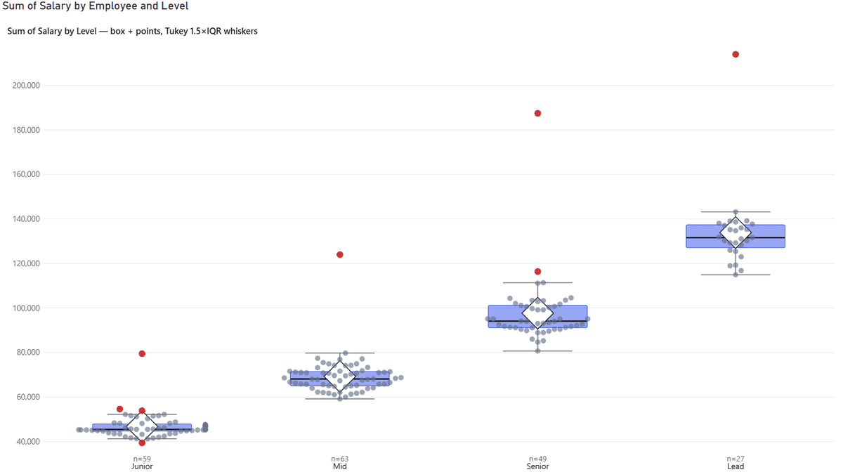
The box spans the first to the third quartile, the line inside is the median, and the diamond is the mean. The whiskers reach to the last value inside the fences; anything beyond is drawn as an outlier.
- Quartile method (Statistics card). Quartiles have more than one definition, and tools
disagree. Pick Exclusive to match Excel’s
QUARTILE.EXC, Minitab and SPSS, Linear interpolation forQUARTILE.INC, R and NumPy, or Tukey hinges. The tooltip names the active method, so a number can always be traced. With the sample file, Junior quartiles are 44,669 and 48,143 under EXC and 44,689 and 47,930.5 under INC, exactly as Excel gives them. - Whisker method. The default is Tukey’s 1.5 × IQR. You can change the multiplier, or use min–max, a percentile range, or ± k standard deviations. The caption always says which.
- Show N per group prints the group size under each box, because a box drawn from six values deserves less trust than one drawn from sixty.
3. Points, violins and layers
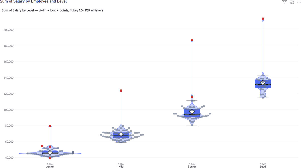
Box, violin and points are three independent layers (Layers card). Use any combination.
- Points → Show: Outliers only (default) or All points. Placement: Beeswarm packs the points without overlap, Jitter scatters them.
- Violin draws a real kernel density estimate. It shows what a box hides: whether a group has one peak or several. A violin needs enough data; with fewer than about twenty values per group it turns into spikes, so prefer box plus points there.
- Density (KDE) card: kernel, bandwidth multiplier or an absolute bandwidth, and whether the curve is clamped at the data bounds.
4. Outliers you can act on
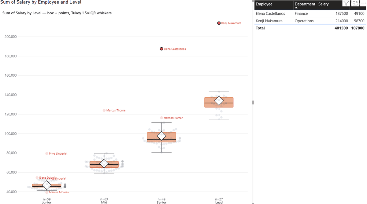
An outlier is a row of your data, not just a red dot.
- Hover a dot for the record’s name, its value and whether it is an outlier, plus any Tooltips fields.
- Click a dot to filter the rest of the page to that record; Ctrl+click adds more; click empty space to clear. Right-click opens Power BI’s own menu, drill-through included.
- Outlier labels card: print the names beside the dots. Max labels per group keeps it readable by labelling only the most extreme ones; 0 labels them all.
5. Histogram
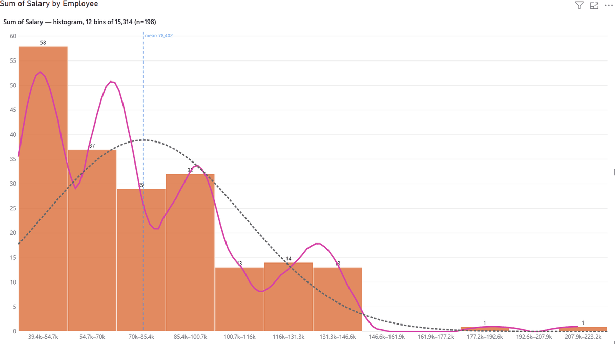
- Binning → Method: Auto (round bins) chooses human-friendly edges such as 20,000; Freedman–Diaconis and Sturges are the textbook rules; Fixed bin count and Fixed bin width give you control. A fixed count of 20 draws exactly 20 bars.
- Y axis shows: count, percent or density. Curves stay correctly scaled in all three.
- Curves (advanced): a kernel density curve, a fitted normal curve, and a cumulative percentage line for a Pareto reading.
- Reference lines (advanced): mean or median, ± k standard deviations, and your own values as a comma-separated list, for example specification limits.
6. Correlation matrix
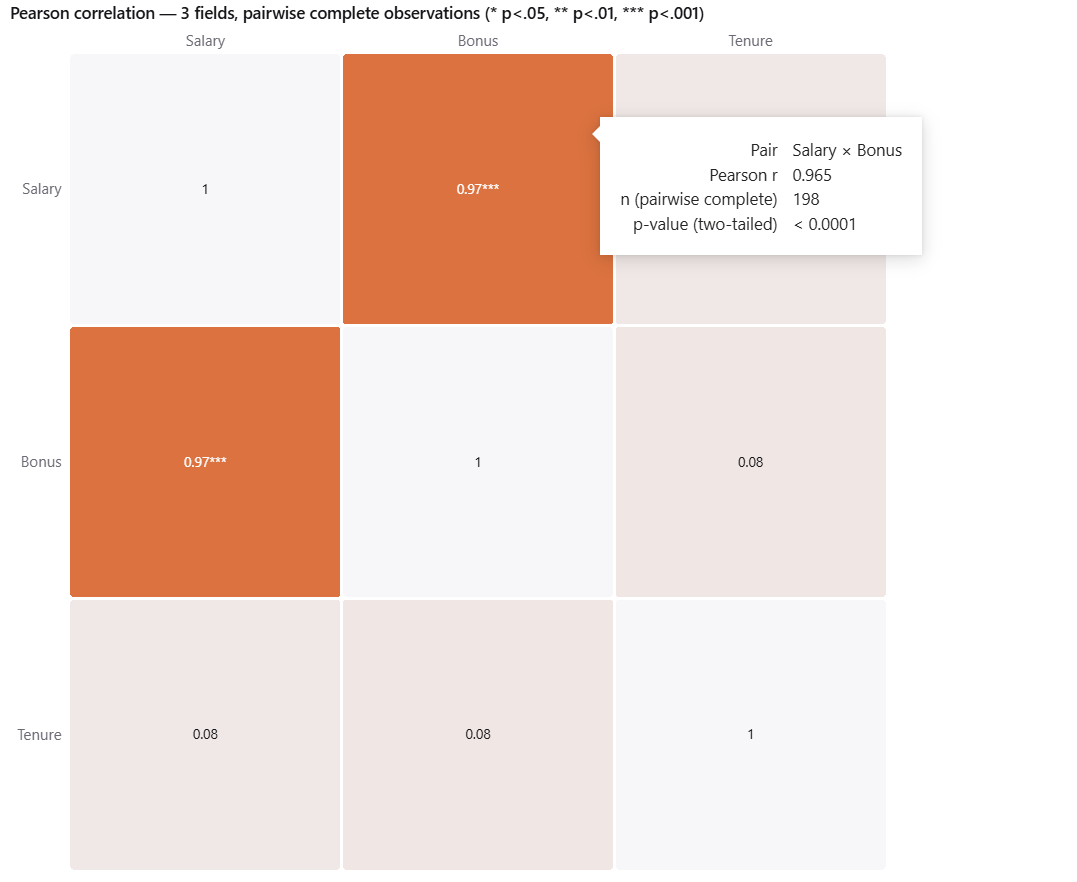
Put two or more numeric fields in Values and keep the Row detail field. Each cell is the correlation between two fields across your records.
- Coefficient: Pearson measures a straight-line relationship and matches
Excel’s
CORREL. Spearman works on ranks, so it also catches curved but steadily rising relationships and is less swayed by outliers. In the sample, Salary and Bonus read 0.97 (Pearson) and 0.98 (Spearman); Tenure is unrelated to either, about 0.08. - Significance stars: * p < .05, ** p < .01, *** p < .001, two-tailed. The tooltip shows r, the number of complete pairs and the p-value.
- Pairwise complete: a record with a blank in one field is left out of the pairs that need that field and kept for the others, and the tooltip tells you how many pairs were used.
7. Legend, colours and text
- Compare by (legend) splits every group side by side. Each legend value gets its own colour, on its marks and on its swatch. Colors → Legend colors chooses between the report theme’s colours, so a value looks the same as in your other visuals, and shades of the accent colour. Legend → Position: bottom, top or right.
- Two text sizes. Axis → Axis font size and color cover the tick labels, group names, the n= line, the legend and reference-line labels. Display → Caption font size covers the caption only. Display → Font family sets one font for the whole visual.
- Smart caption describes the chart in words: field, grouping, layers and whisker method. Override it or switch it off in the Display card. Dark mode is in the same card.
8. Large tables and honest messages
- Every row is used for the statistics, up to Power BI’s own limits. While rows are still arriving a badge says the numbers are partial. A table of 320,000 rows loads in a few seconds.
- Point layer thinning. Drawing hundreds of thousands of dots helps nobody, so above the limit set in Points → Max points per group the point layer is thinned and a banner says so. The statistics still use all rows, and outliers are never dropped.
- “Only one aggregated row arrived” means the Row detail field is missing. “No rows match the current filters” means a slicer has filtered everything out. Neither is an error in your data.
- Log scale switches itself off, with a message, when the data contains zero or negative values.
Something not covered here?
Ask — the answer usually ends up back in this tutorial.